
UI/UX DESIGN
Refreshing Drawn & Quarterly’s
Online Experience
Drawn & Quarterly is a beloved and internationally respected independent publisher based in Montreal. I was responsible for a complete website redesign that focused on usability and a visual style meant to feel fresh and relevant for years to come.
Overview
Role
UI/UX Senior Designer for Webtarget Inc.
Tools
Sketch, InVision
Link
The existing Drawn & Quarterly website had been live for years and contained a vast archive of content — from books and authors to events, blog posts, and press. Over time, the structure had become fragmented: important content was buried, navigation was inconsistent, and standalone widgets functioned as their own disconnected entry points.
Understanding the problem
Objective
Design a modern, cohesive front-end experience without disrupting the existing backend or content structure. The site needed to feel clean, current, and playful, while still reflecting the publisher’s long-established identity and holding up over time.
To begin, I conducted a full content audit to understand how pages, categories, and archived materials were structured across the site. I also met with the client to better understand their goals and preferences for the new site — what they wanted to feel, highlight, and avoid. They provided references of sites they liked, which I supplemented with my own research into comparable publishing, arts, and e-commerce experiences.
Once the new structure was defined, I translated it into wireframes and built a clickable prototype in InVision. This helped visualize layout and flow early on and made it easier to align with the client before moving into high-fidelity design.
Process

Early wireframes exploring layout, navigation, and content hierarchy for the redesigned D&Q site

With the new navigation and structure approved, I moved into high-fidelity design — creating a clean, modern interface that emphasized usability and visual clarity while reflecting Drawn & Quarterly’s playful personality. The goal was to put books and authors at the forefront, while making events, news, and press coverage easier to find and navigate.
I created a consistent visual system for typography, spacing, and content blocks — ensuring the site could handle varied content types while remaining easy to update. Despite legacy constraints, the final site felt cohesive, intuitive, and on-brand — a marked improvement over the fragmented experience of the previous site.
Mobile adaptation was handled separately by the agency’s development team, outside the scope of my design mandate.
Solution


The redesigned website delivers a clearer, more intuitive experience for both new and longtime readers. By simplifying navigation, standardizing layouts, and building flexible content blocks, the site now highlights the publisher’s catalog and community in a way that feels organized, playful, and true to their voice.
Results
More Case Studies
-
![Screenshot of Just Feel It Fitness Website]()
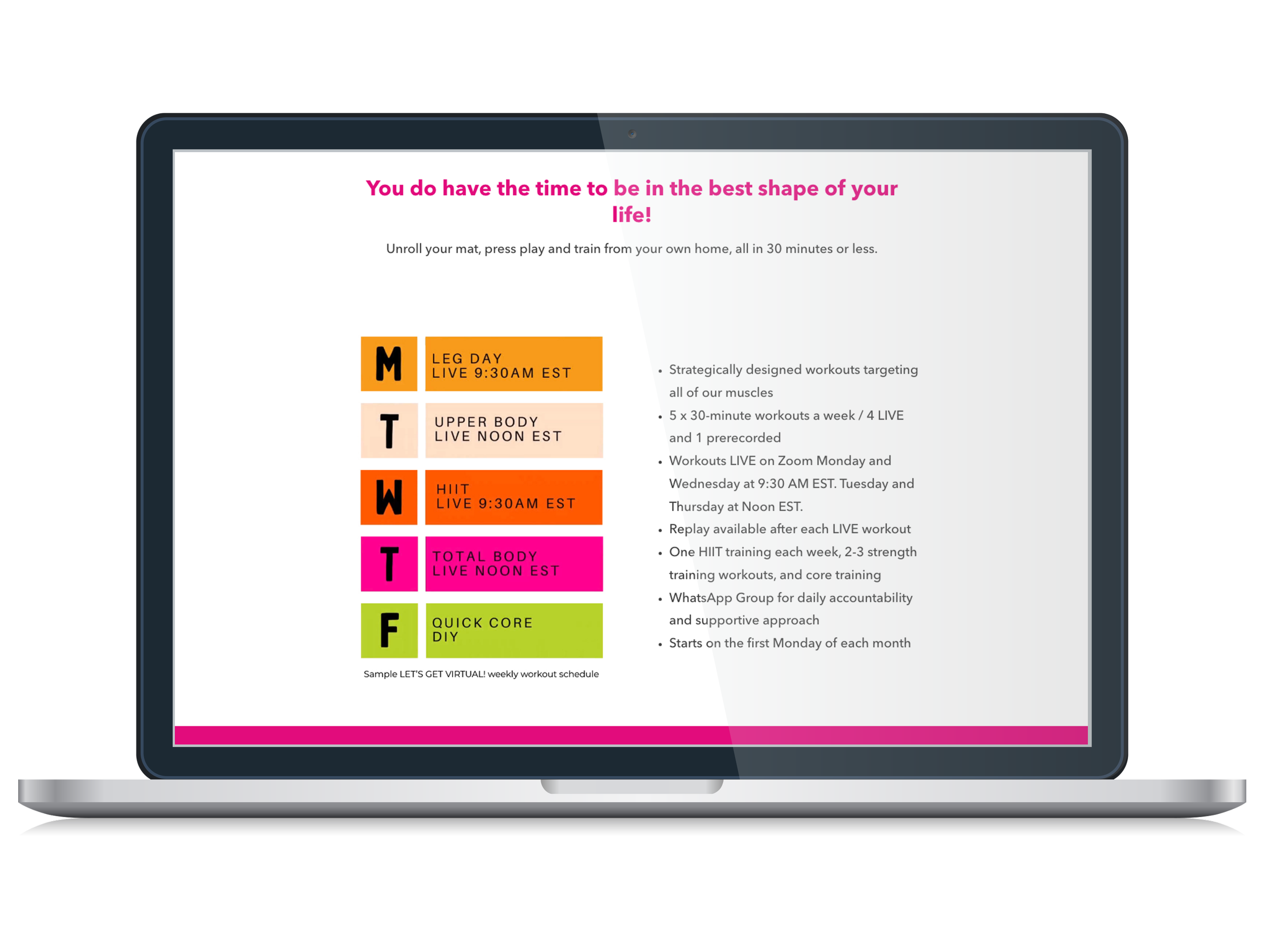
Product Design
Structuring and Automating a Virtual Fitness Program
-
![Screenshot of Drawn & Quarterly Website]()
Process Optimization
Building a Smarter Supply Order System for Stokes