Designing a Classroom-Focused Education Platform
Role:
Product Designer
Tools:
Sketch
GAKKO brought me in to turn a set of early developer wireframes into a functional education platform for teachers, students, and parents. The goal was to create a cohesive interface across three distinct user types, each with specific needs and workflows.
The team leading the project had already begun development and provided rough structural outlines for the teacher portal. My job was to take those rough concepts and elevate them into a complete high-fidelity system while suggesting improvements along the way.
From foundational component styling to full-screen designs, I was responsible for the platform’s design direction, its UI system, and the overall user experience across all three portals.
Understanding the Challenge
The vision was clear: GAKKO needed a reliable interface to serve teachers managing coursework, students engaging with content, and parents keeping up with progress.
My challenge was to create a complete front-end design that solved for immediate needs, worked across multiple devices, and could grow over time.
Objective
Deliver a complete design solution for three portals that:
Aligns with teacher, student, and parent use cases
Uses a consistent and scalable visual system
Feels modern, accessible, and easy to navigate
Supports core features such as messaging, notifications, and task management
Works on mobile devices, specifically for the parent portal
Can evolve with the platform as new features are added
Process
🧩 Component System and Visual Foundations
I began by building a component library inspired by Material Design principles. This included forms, buttons, dropdowns, cards, modals, and navigation elements. Using Material Design as a starting point helped ensure clarity, accessibility, and scalability. The system supported visual consistency across the entire platform and made new screen creation more efficient.

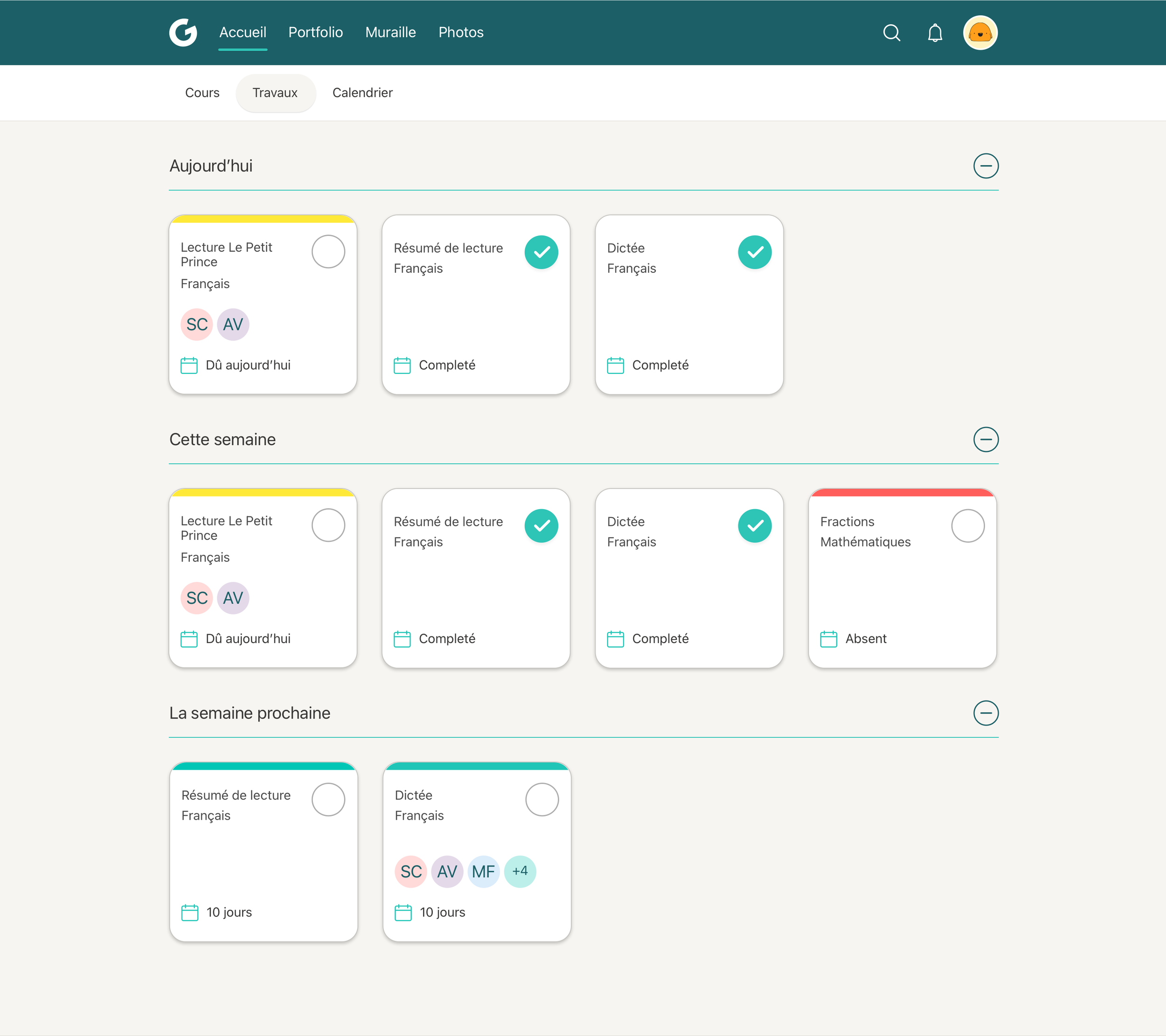
👩🏫 Teacher Portal First
Since the teacher portal would be the most feature-rich and heavily used, I tackled that interface first. This included dashboards, messaging, profiles, notifications, quizzes, courses and homework. The early designs were shared with a group of real teachers who were testing the beta version, and we used their feedback to inform iterative updates.


🧑🎓 Student and Parent Portals
Next, I designed the student portal to complement the teacher view, focusing on clarity and engagement. For the parent portal, I designed a mobile-first experience that made it easy to check messages, review notifications, and stay updated on student progress.


🔁 Feedback and Iteration
Each phase was validated through ongoing collaboration with the developers and feedback from a small group of teachers. Since the platform was being tested as it was built, I focused on shipping only what was essential, making sure every interaction was purposeful and usable.
Solution Highlights
Designed core features like messaging, notifications, and quizzes
Created mobile designs for the parent experience
Streamlined navigation across three portals
Developed a modular design system that made scaling faster and easier
Key Takeaway
Designing across multiple user types requires both structure and flexibility. By creating a component-driven foundation and focusing on critical needs, I helped GAKKO launch a platform that feels unified while still honoring the differences between teachers, students, and parents.